
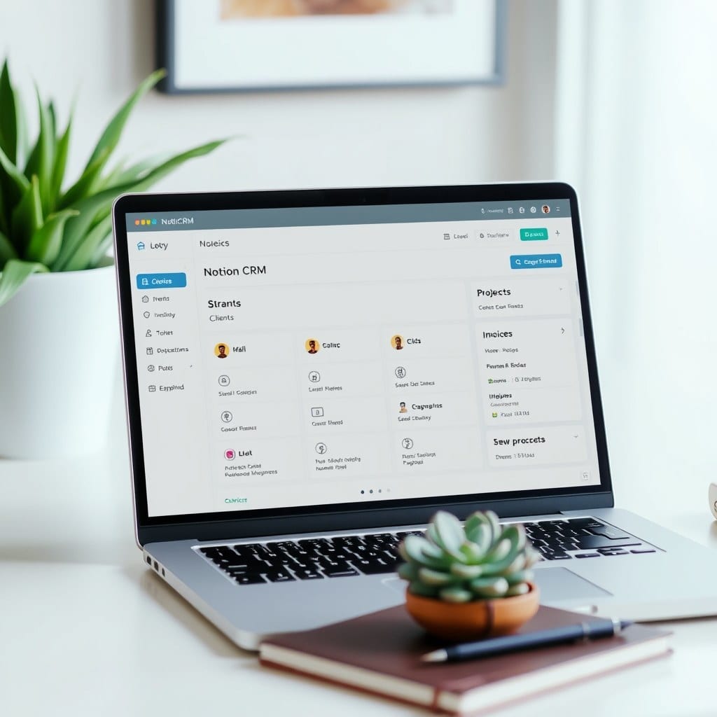
We’ve all been there: you spend a whole weekend building the perfect Notion dashboard, only to abandon it by Wednesday. It looks beautiful in screenshots but feels overwhelming in practice. The problem isn’t you—it’s that most dashboard advice pushes complexity. More properties, more linked databases, more automations. But mindful productivity is about subtraction, not addition.
In this guide, I’ll walk you through the exact process I use to build calm, functional Notion dashboards for myself and my clients. You’ll learn why most dashboards fail, and how to create one that supports your actual workflow without turning into a second job.
## Why most dashboards fail
The number one mistake I see is building a dashboard that mirrors a corporate project management tool. You add a database for every possible data type, then feel obligated to fill every field. But your brain isn’t a spreadsheet. When you open Notion, you want clarity, not a data entry form.
A mindful dashboard does three things: it shows you what matters today, it gives you quick access to active projects, and it leaves room for reflection. That’s it. If a widget doesn’t serve one of those purposes, it’s clutter.
## Start with a single question
Before you open Notion, ask yourself: “When I open my dashboard, what’s the one thing I want to know?” For me, it’s “What should I focus on right now?” So my dashboard leads with a single line: “Today’s priority.” I use a simple formula that pulls from my task database, filtered by today’s date and priority level.
You might want to know what’s on your calendar, or what’s due this week, or what’s inspiring you. Whatever it is, let that answer shape the layout. Don’t start with a template and try to fit your life into it.
## The three-section layout that works
The most sustainable dashboards I’ve seen—and built—follow a simple structure. Top section: a brief “hello” with the date and a focus statement. Middle section: a compact list of today’s tasks or appointments. Bottom section: a space for notes, gratitude, or a weekly reflection prompt.
That’s it. Three sections, no endless scrolling. Your dashboard is a launchpad, not a destination. It should take you less than five seconds to see what you need and click into the right page.
## Keep it fast and flexible
One reason people abandon dashboards is they become stale. A dashboard that requires constant maintenance is a liability. So design for low friction: use simple properties, avoid complex formulas unless they truly save time, and link to your most-used pages rather than embedding every database.
Also, leave room to evolve. Your life changes, so your dashboard should too. Every few weeks, do a quick review: is anything unused? Remove it. Is anything missing? Add it. The goal isn’t perfection—it’s usefulness.
## Try it this week
If you’re ready to build your own mindful dashboard, open Notion and create a new page. Write down your core question, then lay out those three sections. Use a clean font, a soothing color palette, and negative space. You’ll be surprised how freeing it is.
And if you’d rather start from a thoughtfully designed base, check out our Life OS Dashboard. It’s built on these exact principles—simple, calming, and endlessly adaptable. Because a workspace should feel like a meadow, not a mess.