
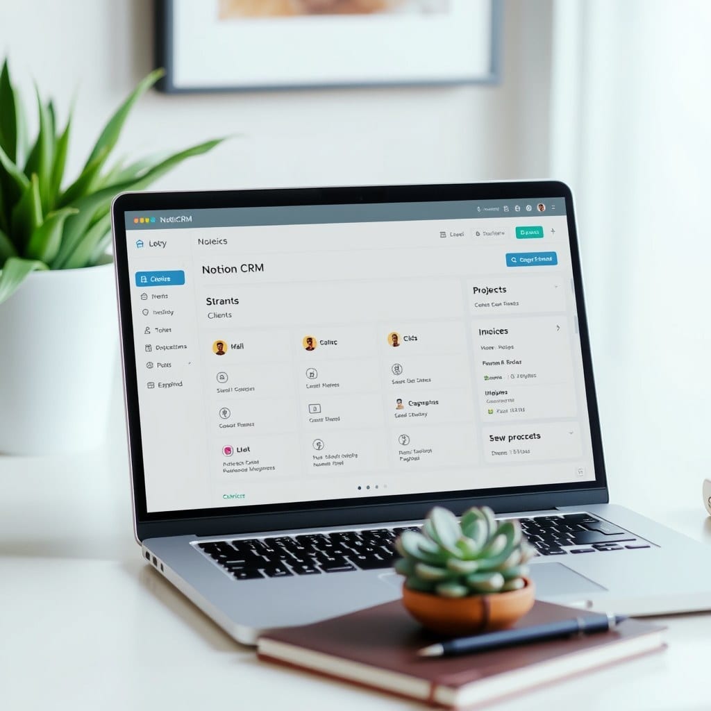
I’ve seen hundreds of Notion dashboards. The ones that stick are rarely the most complex. They’re the ones that answer one question the moment you open them: what matters right now?
Most people start by dumping every possible widget onto a page. A calendar, a task list, a habit tracker, a goal planner, a reading list. It looks impressive for about three days. Then it becomes another source of guilt. You stop opening it. The dashboard becomes a graveyard of good intentions.
The fix isn’t more features. It’s fewer. A calm dashboard does three things: it shows you what’s due today, it gives you quick access to your most-used databases, and it hides everything else until you need it.
Here’s a simple structure I’ve used with dozens of clients. Start with a two-column layout. Left column: a linked view of your Tasks database filtered to ‘Due today’ and ‘Overdue’. Right column: a linked view of your Projects database filtered to ‘Active’. That’s it. No calendar, no quotes, no weather widget.
Why does this work? Because it mirrors how your brain actually prioritizes. You need to know what’s on fire and what you’re actively pushing forward. Everything else — someday/maybe lists, reference material, archives — can live one click away.
Now, the temptation is to add a ‘quick links’ section with 15 buttons. Don’t. Limit yourself to three links max. I use: Inbox, Content Calendar, and Financials. Those are the three places I visit daily. If you’re a coach, maybe it’s Clients, Sessions, and Invoices. The point is to be ruthless.
Another mistake is using too many colors and icons. A rainbow dashboard feels chaotic. Stick to two accent colors and a neutral background. Use icons sparingly — they should aid recognition, not decorate. Your eye should land on text first, not a emoji parade.
What about mobile? Most people check Notion on their phone. If your dashboard has five columns and a giant cover image, it’ll look terrible on mobile. Test it. Simplify until it’s usable on a small screen. Chances are, you’ll prefer the simpler version on desktop too.
Finally, build in a weekly review. Every Friday, spend 10 minutes clearing your inbox, updating project statuses, and archiving completed tasks. This keeps the dashboard trustworthy. If you don’t trust it, you won’t use it.
A calm dashboard isn’t about minimalism for its own sake. It’s about reducing decision fatigue. When you open Notion, you should feel a small sense of relief, not a wave of anxiety. Start with less. You can always add later — but you probably won’t need to.