It’s Monday morning. You open Notion, and your dashboard is a wall of text: blue links, gray bullet points, and a database you set up once and never touched again. You close the tab and open Instagram instead. Sound familiar?
Your Notion workspace doesn’t have to be a source of stress. In fact, it can be the digital equivalent of a deep breath—a place that feels calm, welcoming, and easy to navigate. The problem isn’t Notion. It’s that most dashboards are built like spreadsheets, not like spaces.
Think about the physical spaces where you work best. They’re probably not sterile. They have warm light, a few plants, maybe a good chair. Your Notion dashboard can have that same energy. It starts with a few intentional choices: a soft color palette, generous spacing, and only the elements you actually need.
## Start with a simple structure
Before you add a single property, decide what you need to see the moment you open Notion. For most solopreneurs, that’s three things: today’s tasks, upcoming appointments, and a quick link to projects or notes. Resist the urge to cram everything onto one page. Instead, create a hub page that links out to sub-pages—one for tasks, one for projects, one for notes.
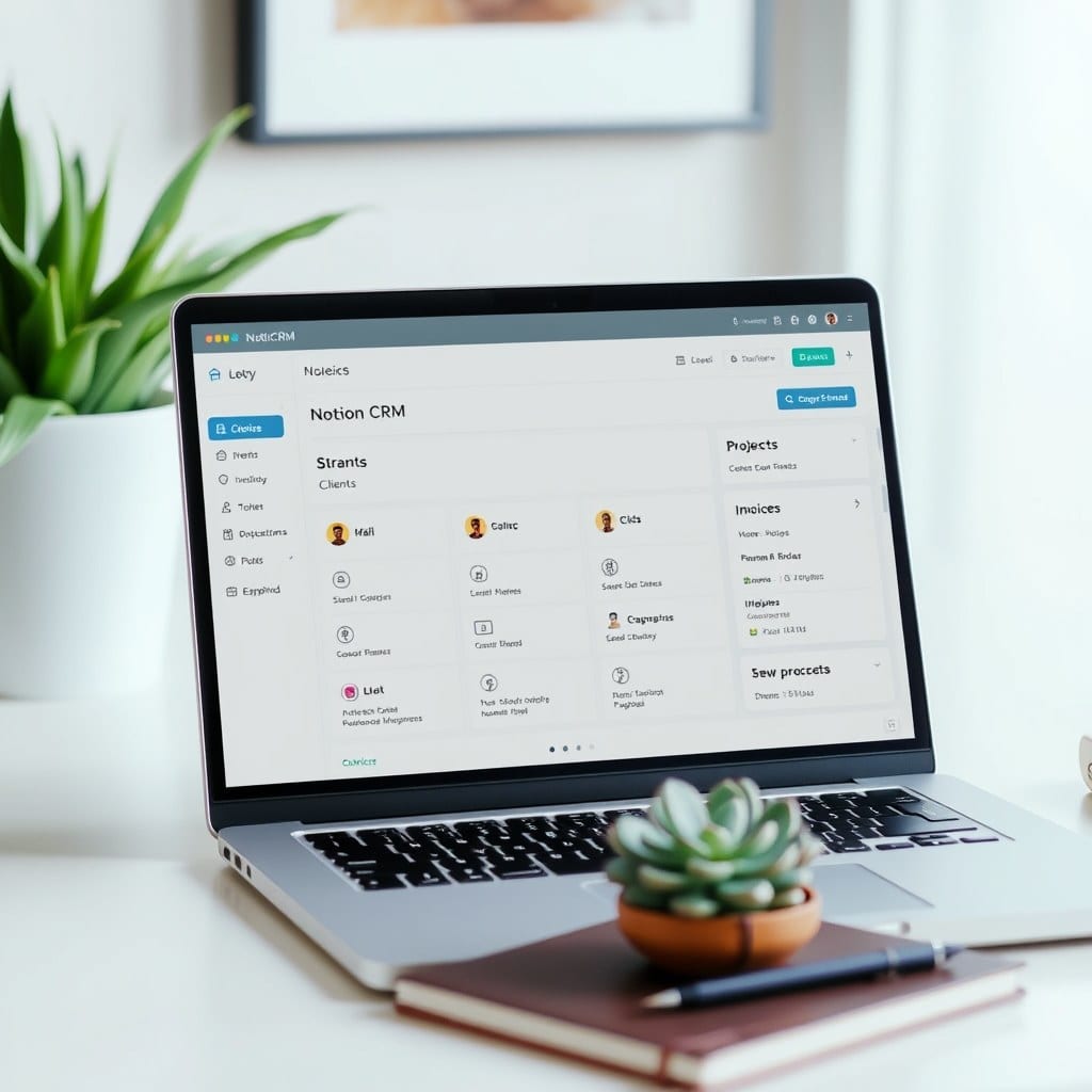
For example, my own dashboard has a large title that says “Today,” followed by a linked database of tasks for the day. Below that, a small calendar view of the week. That’s it. Everything else lives one click away. This might sound minimal, but it works because it respects your attention.
## Choose colors that soothe, not shout
Color isn’t just decoration; it’s a cue. When every page has a different highlight, your brain gets tired. Pick a neutral palette—think warm beige, sage green, dusty pink—and use it consistently. You can set a page cover to a soft gradient or a subtle texture. Keep text dark but not black (try a deep brown or charcoal) and place it on a cream or off-white background.
In one of my templates, I use a muted terracotta for headings and a pale green for toggles. It feels cohesive without being monotonous. You don’t need to be a designer; just pick three colors and stick to them. Notion’s color options are limited, but you can get creative with callouts and dividers.
## Use properties like a librarian
Databases are powerful, but they can quickly become a mess. Before creating a new property, ask: Will I actually filter or sort by this? If the answer is no, don’t add it. A common mistake is adding a “Priority” property with values like “High, Medium, Low.” Do you honestly sort by that every day? If not, skip it.
Better: use a checkbox for “Done” and a date property for “Due.” That’s often enough. For projects, a status property with “Not started, In progress, Waiting, Complete” helps you see at a glance where things stand. Remember: each extra property is a tap you have to make when entering data. The fewer, the better.
## Make room for the personal
A dashboard that only reflects work will feel like a cubicle. Add a small “Today’s intention” text block, a photo that makes you smile, or a quote that grounds you. This isn’t fluff—it’s a cue to your brain that this space is yours.
In my client work, I’ve found that people who add a personal touch to their dashboards stick with Notion longer. They check in more often because it feels like a place they want to be. So after you’ve set up your tasks and projects, spend five minutes adding something that’s just for you.
## Iterate, don’t perfect
Your dashboard doesn’t have to be perfect on day one. You’ll discover what’s useful and what’s not as you live with it. Set a reminder to review your setup every month. Delete what you don’t use, move what feels hidden, and add what’s missing. Over time, your dashboard will become something that genuinely supports your work—a quiet meadow in the middle of your busy day.