
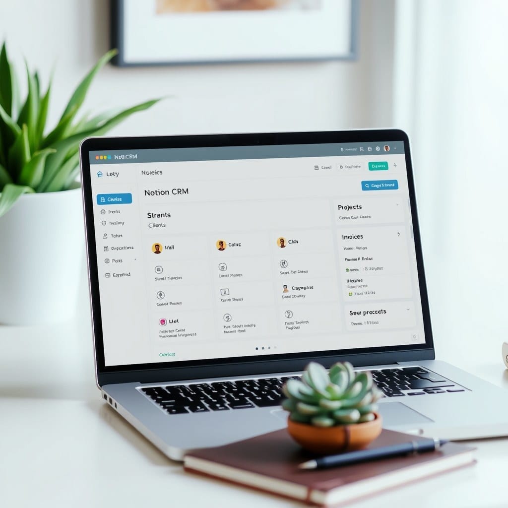
Most Notion dashboards are graveyards of good intentions. You start with a clean page, add a few databases, link them together, and three weeks later you’re avoiding the app entirely. I’ve built and rebuilt my own dashboard more times than I can count, and I’ve watched hundreds of solopreneurs do the same. The problem isn’t Notion. The problem is that we treat our dashboard like a filing cabinet when it should be a compass.
A dashboard’s job is to answer one question: what deserves my attention right now? That’s it. If your dashboard tries to show you every project, every task, every note, and every metric, it’s not a dashboard. It’s a warehouse. And nobody feels calm in a warehouse.
The first step is to pick a single primary view. For most creative solopreneurs, that’s either a today view or a this week view. Not both. I like a simple filtered list of tasks due today, plus a small section for things I’ve committed to this week but haven’t scheduled yet. That’s the core. Everything else lives one click away, not on the dashboard itself.
Next, limit your linked databases to three. I know, three sounds arbitrary. But in practice, three is the most a person can scan without reading. I usually see people link five or six, and the dashboard becomes a scrolling exercise. Pick the three that matter most: maybe projects, tasks, and a quick capture inbox. If you need more, put them on a secondary page called ‘More’ and link to that.
Visual weight matters more than you think. Notion gives you cover images, icons, and colors, and it’s tempting to use all of them. But a calm dashboard uses whitespace as a feature. I keep covers off for databases, use a single accent color for status tags, and rely on text hierarchy instead of color coding. The result is a page that feels like a quiet room, not a carnival.
Here’s a concrete example. One of our customers, a freelance illustrator, had a dashboard with 11 linked views. She felt guilty every time she opened it. We rebuilt it with three views: Current Projects (a board), This Week (a filtered list), and Inbox (a simple list). She told me later that she now opens Notion first thing in the morning instead of avoiding it. Same data, different frame.
Another trap is the ‘someday’ section. Someday isn’t a priority, and putting it on your dashboard makes it look like one. Move it to a separate page called ‘Ideas’ and only visit it during a weekly review. Your daily dashboard should be about execution, not aspiration.
Finally, build in a weekly reset. Every Friday, spend ten minutes clearing your inbox, updating project statuses, and choosing your top three priorities for the next week. This keeps the dashboard trustworthy. A dashboard you don’t trust is worse than no dashboard at all, because you’ll second-guess every item on it.
If you’re starting from scratch, resist the urge to build everything at once. Start with a single tasks database and a simple today view. Use it for two weeks. Then add one more element, like a project tracker. Slow growth is how you end up with a system that lasts.
And if you’d rather skip the trial and error, our own dashboard template follows these exact principles. It’s three linked databases, a weekly reset checklist, and a calm layout that doesn’t shout at you. You can duplicate it in about a minute and start using it today. The point isn’t to have the prettiest Notion page. The point is to have one that helps you do your best work without the mental clutter.